
Anna Mitchell
THE BRIEF
Anna Mitchell is a copywriter and LinkedIn content strategist. She’d previously launched her copywriting business and designed her own brand identity having taken my Brand Identity Masterclass. Anna reached out when she was preparing to reposition her offers, deciding it was time to elevate her personal brand as well. Anna expressed that while she was really great with words, she was bad with design. My goal was to give her personal brand a professional edge and a brand identity system she could use with ease.
SCOPE OF WORK
Brand Identity Design
Tagline Development

THE STRATEGY
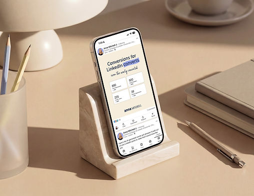
An Editorial Visual Strategy
Factoring in her background as a copywriter, I designed her identity around an editorial aesthetic. This concept came to life in two signature ways: treating her primary logo designs as iconic mastheads and using repeatable motifs like highlights and annotations.


DESIGN
Strategic Typography and Personality Alignment
The logo’s typographic pairing balances warmth with professional authority. To capture her friendly and approachable personality, her first name appears in a bold, lowercase sans serif. To represent her professionalism and expertise, her last name shows up in a more refined serif, displayed confidently in all caps. This intentional contrast reflects her brand personality and allows prospective clients to see both her human warmth and high-level strategic skill.


DESIGN
Creating Harmony with Subtle Design Choices
Visual balance contributes to the brand’s overall first impression. Using contrasting casing in her logo designs created clean visual boundaries and eliminated awkward negative space. Additionally, small customizations were made to individual letters to create visual unity across the brand’s primary and secondary logos.


DESIGN
Enduring Typographic Distinction
To complement the editorial narrative, I wanted her brand’s font system to be compelling and timeless. The goal was to find a heading font that would successfully balance the masculine energy that largely dominates LinkedIn with a touch of feminine softness. This gorgeous semi-serif typeface did just that. Its bold weight offers strong structural presence, while generous letter tracking provides breathing room and visual clarity across digital screens.

DESIGN
Prioritize Ease of Recognition
Anna wanted her audience to be able to quickly recognize her brand on screen. This would be achieved through her brand experience. To emulate the back-and-forth process of narrative copywriting, her creative would showcase annotations, comment bubbles, and signature highlight motifs. Each of these subtle visual cues mimic editorial markups, reinforcing her expertise with language.


DESIGN
Functional, Branded Design Details
To add versatility without adding design complexity, I designed a simple collection of brand bullets. Hand-drawn asterisks, stars, and directional arrows add a tactile, personal quality—reminiscent of margin notes in a draft. These elements break up dense copy, guide the reader’s eye, and infuse her digital touchpoints with authentic personality.

"Worth every penny."
Anna Micthell
You might also enjoy these personal brand identities


