

BE3Designs
THE BRIEF
Rebranding your business can be daunting. Especially when you've been in business for 16+ years. BE3Designs is a beloved web development freelance business based in Edmonton, Alberta. In operation since 2010, Bree prides herself on having a range of website services to help everyone, no matter what level of web experience they may have.
This fellow creative entrepreneur often had ideas she wanted to explore but lacked any official brand to see those ideas through. So when she reached out to me to embark on her first professional rebrand, she presented her idea to *gamify* the narrative of her brand identity. A lover of video games and table-top roll playing games, she had already developed the gamified language for her range of services. We just needed to develop the visual language that would bring it all to life.
SCOPE OF WORK
Brand Identity Design

THE CHALLENGE
Two Rebrand Must-Haves that Worked Against Each Other
A web developer herself, Bree was an advocate for web accessibility standards. It was expressed from the very beginning that this rebrand needed to prioritize design accessibility so all users online could experience the brand without limitation. This meant making design decisions that were WCAG compliant.
The other must-have was carrying forward her signature orange brand colour that had long been associated with her brand. Honouring a brand colour in the rebrand is hardly a problem, except that orange is an extremely challenging colour to work with when trying to design a brand that’s compliant with web accessibility standards.


THE STRATEGY
Developing a Logical Visual Narrative
To approach her brand development, I needed to understand the role her business—and therefore her logo—would play in this gamified narrative in order to approach the design accordingly. We established that her business was a guild, so her logo must represent this guild. We landed on a bee as her iconic guild symbol. Equipped with blade wings and all, the bee represents hard work, cooperation, and productivity—all underlying values her brand is known for.

DESIGN
Going Beyond Brand Basics to Shape a Truly Unique Brand Experience
Bree had a work-in-progress outline for how she would present her services under the guise of gaming. This language outline presented two creative opportunities that we’d expand upon with her brand deliverables.
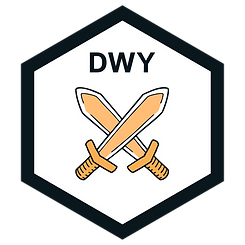
We fully embraced this brand narrative through visual storytelling. First, presenting her website service types as different player modes to choose from. One player for Do It Yourself, two player for Done With You, and Non-Playable Character for Done For You. Designing these as player mode cards helped communicate to her audience the difficulty level and expectation for each service type.
Beyond that, each unique service type was given its own customized service emblem. All of these extra brand details were customized thoughtfully to align with the BE3Designs guild narrative we were developing while simplifying the user experience.


DESIGN
Customizing the Logo Typeface to Make it One-of-a-Kind
Another detail my client was eager to carry forward was the use of a condensed typeface for her logo. To add more depth and intrigue to the brand's wordmark, the individual letters were customized to have subtle shadow cuts without being too stylized. This approach gives the brand a strong presence while maintaining a clean and simple aesthetic that will endure for years to come.
DESIGN
Rebranding for Accessibility
When it came to selecting brand typography, we had to source specific typefaces that have been designed to promote legibility by way of unique letter characteristics. It also meant establishing specific brand guidelines that ensured font size, font weight, and font casing were all meeting accessibility standards.
For the brand's colour palette, we tested all colours in the development process before establishing clear brand style guidelines that designate specific colour combinations that are AA compliant for web accessibility standards, including her signature orange hue.


THE RESULTS
Unlocking an Idea that Will Set the Stage for Future Creative Endeavours
This idea Bree had long been exploring on her own was now fully realized through her rebrand. It also opened the floodgates of possibilities. She and I are continuing to expand on her initial idea with new service offers and ways to build out this gamified world she’s shaped around her business.

I took away more than just a new brand identity, I have confidence, direction, and excitement in my business
I came to Jenny Henderson Studio with a concept that I had been ruminating on for some time, but inevitably needed professional help with bringing it to life. And Jenny did just that! I found the discovery and review questions that Jenny asked were very helpful in navigating through my own notes, thoughts, and scribbles. We determined what direction wouldn’t work for me before we solidified what would, and it was a very educational and resourceful experience. I took more away than just a new brand identity, I have confidence, direction, and excitement in my business going into 2026!
Bree Emmerson, BE3Designs
You might also enjoy these brand designs


