
Science of Reading in Practice
THE BRIEF
The Science of Reading in Practice emerged from the Scholastic book series of the same name. Led by two of the authors, this duo is on a mission to transform literacy instruction by offering every educator the opportunity to deepen their understanding, refine their practice, and collaborate with a nationwide community of peers and experts.
Their goal was to expand the book series into the leading literacy learning hub for teachers and education professionals. This meant designing a brand identity system that would support their marketing efforts while also creating dynamic and engaging content for professional learning conferences and events.
SCOPE OF WORK
Brand Identity Design
Brand Extension Logos
Website Design
Email Marketing
Presentation Deck Design


THE STRATEGY
When the Audience Grows Tired of the Industry Standard, You Offer Them Something New
Do any research on the literacy education space and you’ll quickly realize that the vast majority of literacy brands appear to be designed for a youthful, elementary audience. But the target audience for these brands is actually made up of teachers and education professionals. Recognizing that this audience is already inundated with primary colours and playful fonts in their everyday, this revelation set the course for the brand’s creative direction. We wanted to create something new and refreshing for the literacy space. We wanted the Science of Reading in Practice brand to be designed for teachers, not their students.

THE STRATEGY
Earning Credibility with Micro-Brand Assets
Despite being in the early planning phase of the business, they had a clear vision for their future programs and events. Rather than positioning these as a simple offer suite, I decided to package these programs as micro-brands. These brand extensions would be the heart and soul of the business and deserved a cohesive logo suite of their very own.
Providing these logo designs in the beginning equipped them with consistent brand assets that would play a key role in fostering trust and credibility for the launch of these programs and the brand overall.

DESIGN
A New Visual Standard for the Literacy Space was Achieved through Strategic Design Choices
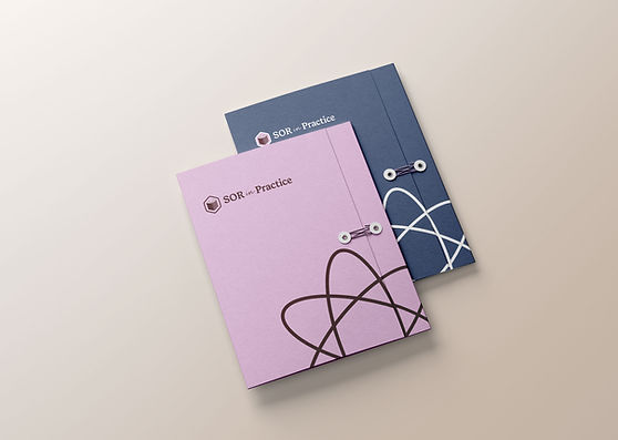
Breaking away from industry norms, we approached the brand identity with a mature audience in mind. Instead of jovial brand fonts for the logo and headlines, the brand presents a soft, serif typeface that captures a personality that is both professional and friendly.
Instead of vibrant yellows and basic reds and blues, we landed on a brand colour palette that balanced earthy tones with deep, contrasting hues, and subtle pops of colour. The design challenge was that the colours of the brand still needed to complement the cover designs of the Scholastic book series, which still favoured more elementary colours.


THE RESULTS
Their intention was to create a learning space that was simple to use, easy to understand, and beautiful to experience. Together, we developed a brand identity that instantly communicates the scientific research the brand is rooted in while resonating with their mature audience of educators.
In addition to the brand's standard logo suite, a series of logo designs were designed for their key programs. These brand extension logos not only simplify internal operations, but also create a unified, intuitive offer suite that reinforces the strength of the overall brand.

You might also enjoy these brand designs


