
BWCollective
THE BRIEF
Since 1988, this Toronto retailer has established itself as a pioneer of streetwear culture in Canada. The business—formerly Broadway Fashion—had evolved over the years, but their brand had not and they were overdue for a modern rebrand. In partnership with my own brand client, Araia Marketing, I was hired to lead the visual rebrand under their new name, BWCollective.
SCOPE OF WORK
Brand Identity Design
Creative Strategy

THE CHALLENGE
A Not-so-Premium Brand Selling Premium Brands
Broadway Fashion established itself as a curator of elevated streetwear. They didn’t chase trends, they had a hand in shaping the culture here in Canada, often being the first ones to bring hard to find labels to the Toronto fashion scene.
In spite of their enduring success spanning over three decades, their brand identity was outdated, unpolished, and no longer aligned with the premium brands they were selling.
Adapting to the E-Commerce Evolution
Their brick-and-mortar shop wasn’t enough to compete with the rise of e-commerce. Their competition grew as premium retailers were growing their marketshare through online sales. This rebrand not only had to create a premium brand experience that would reposition them as a leader of elevated streetwear, but also establish a clear creative direction for elevating their online store and brand experience.

THE STRATEGY
Honouring their Legacy as a Trusted Curator of Elevated Streetwear
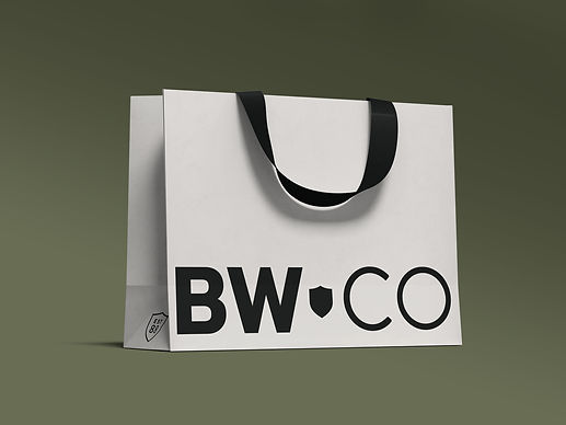
Growing strong since the 80's as an independent retailer is a testament to the vision and credibility they've brought to the community. We wanted to honour and celebrate their legacy through the identity rebrand by way of a distinct brandmark. A badge that tells future generations of the culture they've helped shape and continue to shape with them in mind.


DESIGN
A Minimalist Design Aesthetic Means Getting Creative With Less
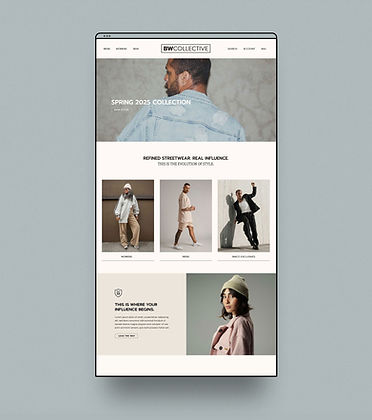
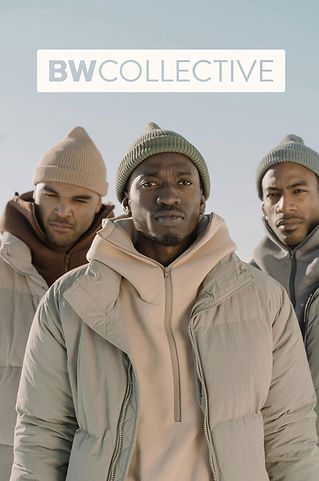
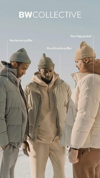
This rebrand was more than just a new name, logo, and colour palette. The vision for the rebrand was to design a clean, polished look for the evolution of this legacy brand. We knew the heart of this brand experience would be captured through striking, editorial brand and product photography. The goal was to keep the brand assets fairly minimalist and develop a strong creative strategy that would translate those assets into a premium brand experience across social media and promotional designs.

DESIGN
Establishing Brand Guidelines for Memorable Marketing
During the brand development, a series of creative approaches and brand guidelines were conceived to ensure marketing campaigns and social media storytelling would be memorable, compelling, and distinct.
Instead of the standard primary and secondary colour palette, we established clear brand colour guidelines to demarcate seasonal apparel launches. For their loyal customers, it establishes a strong and memorable association for each new seasonal drop.


DESIGN
Using Colour as a Strategy for Distinction
For the brand colour palette, we wanted to distinguish this retailer from the overly monochromatic aesthetic of similar apparel brands. Instead of the traditional black and white palette, we opted for a palette that felt warm but luxurious. Using a deep umber brown showcases the distinct style and power of individuality this brand aims to represent.

THE RESULT
A Magnet for the Next Generation of Trendsetters
The rebrand generated immediate excitement and curiosity. Long-time customers responded positively, recognizing the move as a natural evolution of the brand. The new identity has also successfully bridged the gap to a younger, urban demographic across both Gen Z and Millennials.
Since the reveal, BWCollective has seen a strong spike in high-intent social metrics. The launch of the newly branded website has significantly boosted visibility. Users are spending more time exploring the site, suggesting that the visual hierarchy and clean UI have established immediate brand authority.

You might also enjoy these brand designs


