


BRAND DESIGN
MAMA ETC.
genuine, approachable, organic
ABOUT MAMA ETC.
Mama Etc. is a holistic approach to perinatal care. Their goal is to increase confidence in birth and in parenting for every family they serve. Located in Ottawa, the name emerged as a bilingual approach to a multifaceted business model. The primary direction of the brand is that of a lactation specialist. The goal of the brand design was to be organic and trustworthy, beautiful but imperfect.


The brand is all about trusting your instincts and growing confident in your own ability as a parent. The design itself is inspired by nature and its ability to persevere. Flowers don't stress about being a flower, they just grow.
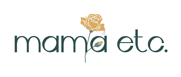
The flower and bud in the design represent the relationship of mother and child. The design, which includes a drop of water on the verge of falling, represents nature's ability to take care.
The flower wordmark design is one incorporates the placement of the bud into the letter 'a' pays an homage to a pregnant belly.


Including the "etc" into the brand name was meaningful in that the practice is diverse in all things motherhood. We worked to give even more meaning to the "etc" of the name. So we developed a tagline to serve the brand: empower, teach, care.
Mama Etc. prides themselves on providing tangible skills to educate and pamper their clients, help reduce stress, enhance bonding with their new baby, in an effort to easily adjust to a new normal.
The primary colour palette includes a rustic gold hue which we've named liquid gold. The significance of this tone is more than the warmth it brings to the brand. It correlates to a mother's first milk which is referred to as liquid gold for all of its immune-boosting properties.
The long-term goal of the brand is to become the area's lactation specialist, the training for which is quite lengthy and involved. The overall brand design makes room for this evolution of the brand with the drop icon. It is used in the design and repeated further in the grander design and throughout the brand identity.


I didn’t expect nearly as much as what I got from her

Jenny Henderson is an absolute pleasure to work with. She was able to take my (often very confusing!) requests and ideas and take them to the next level, turning them into something beautiful. She really helped me take a good hard look at my brand and shape its personality, and gave me valuable advice along the way. I didn’t expect nearly as much as what I got from her! I recommend her whole heartedly.
Catherine Lavoie Gosselin, Mama Etc.
You might also enjoy these brand designs


