Designing a Brand Identity that Meets Web Accessibility Standards
- Jenny Henderson

- Nov 19, 2025
- 5 min read

I’d been designing brands for almost five years before I’d had a client ask that I prioritize accessibility standards for her brand identity. It dawned on me that I didn’t really know much about web accessibility design or what that meant for the creative process. Regardless, I was happy to have a new creative challenge and educate myself on the best practices for designing a brand that would better cater to the needs of all users.
Whether you’re a brand designer learning about accessible design or are just a business owner determined to be more conscientious with how you present your brand online, this blog is for you. This guide breaks down the essentials so you can make informed design decisions that support accessibility without sacrificing aesthetics.
CONTENTS
WHAT ARE WEB ACCESSIBILITY STANDARDS AND WHY ARE THEY IMPORTANT?
For businesses operating online (I mean, who isn’t these days?) it’s important that we are making our websites accessible for all users. Whether it’s using alt text to describe images for the visually impaired or using accessible fonts that help those with dyslexia, there’s so much we can do to remove barriers for people with disabilities.
Website developer and brand client of mine, Bree of BE3Designs put it this way in her blog post Are you making these common accessibility mistakes?: “A neurological disorder, visual impairment, dyslexia, ADHD, or other disability can impact a person’s ability to navigate, comprehend, and interact with your website.”
The Web Content Accessibility Guidelines (WCAG) are the leading standards for making the online space accessible for those with disabilities. So let’s take what we know and use these guidelines as it relates to brand identity design.
FOLLOWING WEB ACCESSIBILITY STANDARDS IN BRAND DESIGN
If you’re on the verge of rebranding, there are two key areas you’ll want to pay attention to as it relates to designing for web accessibility standards:
font usage
colour contrast
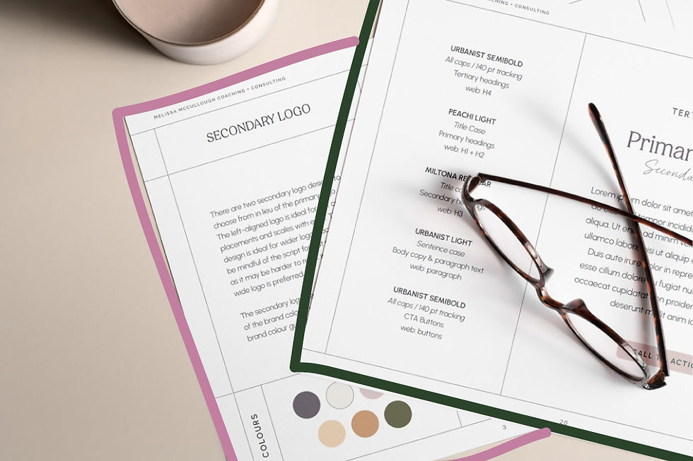
Accessibility and Font Usage
Accessible typefaces are those that have been designed to promote readability. People with dyslexia will have a harder time distinguishing certain letters and numbers from one another, such as:
pq
lI1
bd
ae
0OC
eco
nu
69
rn,m
Discernibility, letter mirroring, and imposters—letters that look like other letters—are font details you’ll want to pay attention to when selecting brand typography.

In addition to looking for accessible typefaces, font scale, casing, and font weight are all important design details to factor into brand identity styles. Here are some web accessibility design tips for font usage:
skip the condensed font or script font for your brand typography
don’t use a thin font weight
use larger font sizes across your website
avoid writing headlines in all caps where words lose their unique shape
be sure to use accessible font colour combinations (more on colour usage below)
The Most Accessible Fonts for Your Brand
While many serif typefaces are easier to read because of their distinguishing characteristics, it’s the sans serif typefaces that become more problematic. But online, sans serif typefaces are preferred for they are easier to read on a screen.

While your logo design may not need to be as compliant, the typography you use in your brand identity should absolutely prioritize accessibility standards. In my hunt for aesthetically pleasing accessible typefaces, here are some of my favourite most accessible Google Fonts:
SANS SERIF
Lexend Deca
Atkinson Hyperlegible
Inclusive Sans
Reddit Sans
Work Sans
SERIF or SLAB SERIF
Literata
Roboto Slab
Roboto Serif
Merriweather
The Importance of Colour Contrast for Accessibility
In curating a brand colour palette, adequate colour contrast for accessibility is a top priority to ensure text is clear and legible. What I quickly learned in designing brands to meet accessibility web standards is that you may assume your colour combinations are high contrast, but when put to the test, they simply don’t cut it.
You’ll want to use a colour contrast checker as you’re selecting brand colours to make sure they’re compliant. Make sure you’re using a tool that follows the most recent WCAG formula for colour contrast.
Among the levels of compliance, AA is the more widely accepted standard whereas AAA is the most strict with the highest contrast ratio. Now let’s take a look at a couple of client examples and how we met web accessibility standards in the brand development process.

EXAMPLES OF ACCESSIBLE DESIGN IN BRAND IDENTITIES
Knowing your audience and being true to your core values will help you determine if designing your brand identity for web accessibility standards is important for you to pursue.
Julia B. Lindsey is one of North America’s leading literacy experts. She expressed early on that it was important, as a literacy expert, that her brand identity be compliant with web accessibility standards. Here’s what we prioritized in her brand identity and subsequent guidelines:
functional colour palette that met AA compliance
use of accessible typefaces
clear guidelines on accessibility font sizes and font weights


For my client, Bree, whose blog post on accessibility I quoted earlier, it made sense that her rebrand prioritized these standards because she is a web developer herself.
The creative challenge here was that she wanted to carry forward her signature orange into the new brand identity. But orange is one of those hues that often struggles to meet contrast requirements. So we had to be super clear in the dos and don’ts of using her brand colours.
Here are the examples of accessible design choices we prioritized for the BE3Designs rebrand and subsequent guidelines:
clear guidelines for accessible font colours
distinct restrictions on signature font colour usage
use of accessible typefaces

MAKING WEB ACCESSIBILITY STANDARDS PART OF BRAND GUIDELINES
With much nuance to factor into the brand design process, any business prioritizing web accessibility standards will want to establish clear brand guidelines around them. As a brand designer, I loved using this colour contrast checker tool because it allows you to enter multiple brand hex codes and test them, more or less, at once.
Keep in mind, a brand identity doesn’t need every colour in a brand palette to work together, but the brand does need to set specific guidelines for approved, accessible colour combinations.
What you’ll notice when using a colour contrast checker, is that some colour combinations are not approved for normal sized text but are approved for larger text. For my client Julia B. Lindsey’s brand identity, you’ll see in this example below that white text over her brand pink didn’t pass the required contrast ratio for AA normal text but it did pass for large text.

In creating her brand style guide, one brand colour guideline specified that white text over pink needed to be a font size greater than 18 points (24px) or bolded at font size greater than 14 points (19px). This is an example of a style guideline that prioritized accessible font colour usage for her brand identity.
BALANCING AESTHETICS AND ACCESSIBILITY STANDARDS
Yes, aesthetics are important when it comes to brand design. But design is and always has been about solutions. Prioritizing accessibility doesn’t limit creativity. If anything, it pushes designers like myself to create smarter, more intentional brand systems.
If you’re a business owner looking to rebrand or build a brand identity that’s both visually compelling and aligned with web accessibility standards, I’m here to help. Visit my brand design services for small businesses and let’s design a brand that works beautifully and inclusively.

Pin This


Jenny Henderson Studio develops memorable brand experiences and strategic brand foundations to improve recognition and revenue for service-based small businesses.


Comments